Garden in Bloom meets Fun Frames

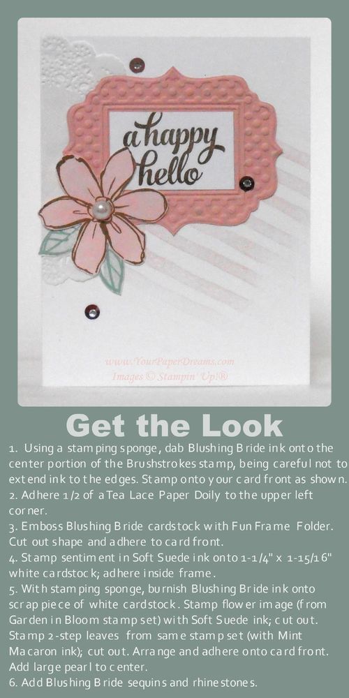
Get the Look - Garden in Bloom meets Fun Frame

One of today's trendy looks is creating a focal point from a grouping of individual elements. Often, the sentiment is included as one of those grouped elements, and there may also be subtle texture or other visual interest in the background. This card features all of those.

Those who've been following me for a while know that some of my favorite techniques involve applying ink in non-traditional ways. This card features two such examples.

The diagonal lines of the background represent the first such technique. To get that look, I inked a stamping sponge (just by pouncing it on the Blushing Bride pad), and then dabbed it onto the center portion of the Brushstrokes stamp. I was careful to avoid extending the ink as far as any of the edges of the stamp, as that would give a harsh edge when stamped. Rather, what I was looking for here was a softer, more cloudy look, where the inked image just kind of fades in and out. Once the ink was applied, I stamped the background at that jaunty angle for yet more visual interest.

Another favorite way I like to use ink a little "out of the box" is when I want a piece of colored cardstock that's more subtle than the intense colors of our regular cardstocks. In this case I wanted a Blushing Bride flower, but a much softer shade of it than the Fun Frame it would be backed with. So I just burnished Blushing Bride ink onto a scrap piece of Whisper White cardstock with a stamping sponge before stamping the flower image onto it. (My version of "burnish" is to rub ink down into the cardstock in a circular motion. I actually do try to rub the ink right into the cardstock, so I start with a light hand and then get firmer and firmer as I rub in circles. Every time I reload the sponge from the ink pad I am careful to tap my sponge off once or twice onto my scratch paper so I don't accidentally get a "blob" of ink when I first touch the paper I'm working on. You can always add more ink, but can't take it away if you get a "blob", ya know.) So once I decided I had the color intensity I wanted for this, I just stamped the flower image (from Garden in Bloom) right onto my newly-colored paper and then fussy-cut it with Paper Snips.

The leaves are stamped in the more usual 2-step method this stamp set was designed for….. and then also fussy-cut.

When I first introduced this card at card class last month several of the ladies groaned at the assumption they'd have to cut out the center section of the embossed Fun Frame. But no worries there; it's just it's own layer of Whisper White cardstock (1-1/4" x 1-15/16") – stamped and applied on top of the frame! Easy-peasy!

Even though none of these elements is popped up on Stampin' Dimensionals I still wanted to retain a suggestion of depth anyway. So I only applied adhesive to the center areas of the frame, doily and flower, leaving their outer edges free.

Oh! And a tip for applying the sequins: place a tiny dot of Fine-tip Glue where you want the sequin to be, then lay the sequin right over it. Remember – that's a "TINY!" dot, in order to avoid a glue smear!

Don't you think this same general layout would be fun to work up into a Christmas card? I'd love to see your examples if you do that!


Product List
A big ol’ pile of notecards

Just finished making a big pile of these notecards, and I simply can't get enough of this Butterfly Basics! I am going to be SOOOOO sad if that stamp set doesn't make it into the upcoming catalog! Thankfully, we demonstrators will get to see the new catalog early tomorrow morning, so I don't have too many more hours to speculate and worry, lol.

Butterfly-Basics-notecard----web

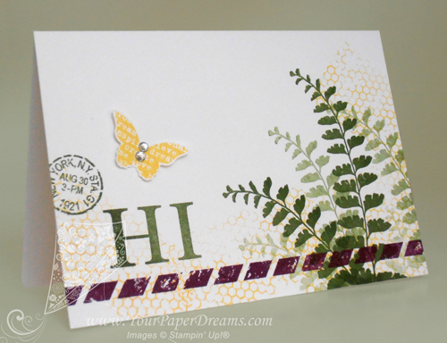
As I was selecting colors for this design I knew I would use a green, of course, and I wanted 2 other bright colors as well. So I started by pulling out Mossy Meadow for my green, and then grabbed that super-yummy Blackberry Bliss as long as I was in the 2014-2016 In Colors section anyway. Daffodil Delight, which was already on my work table, seemed handy for the remaining 3rd color.

When I work with 3 different colors I usually think in terms of "large", "medium" and "small" volumes of the colors. So I decided for this card my "large" volume would be  Mossy Meadow, "medium" would be Daffodil Delight, and the splash of "small" would be done in Blackberry Bliss.

I started by playing around a bit with 1st, 2nd, 3rd and 4th generation stamping for the fern images….. working to get the angles (and rhythm) arranged in a way that would be quick and effective for the couple dozen I was just about to crank out. So that part went down first – on the entire pile of notecards. (Actually, when I'm cranking out a big bunch of cards just alike, I prefer to work assembly-line style, doing the same step on each card. That gets me in a rhythm and eliminates putting tools down and picking them back up again. Because every time you open or close an ink pad, or pick up or put down a stamp, time is ticking by.)

P4290196---webNext came that whimsical and unexpected stripe of Blackberry Bliss parallel to the bottom edge, and then a grouping of 3 images to help balance the weight of the dark ferns. The first part of that grouping, the word "HI", is from Sophisticated Serifs, another Occasions Catalog stamp set I surely hope also transitions into the upcoming catalog because I've found a lot of uses for THAT, too!

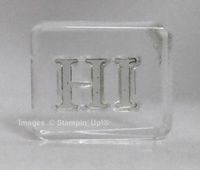
To get the letters even with one other I started by laying them down on the grid surface of my paper trimmer, the same way I demonstrated here. Once they seemed properly aligned, I just set my acrylic block straight down on top of them (with its lower edge also aligned with the grid) to pick them up as a unit. Of course I tested them on my grid paper before proceeding, and ended up adjusting the "I" slightly before calling it perfect. But from there on I was able to stamp the two letters together as one image. For placement, I just eye-balled it and aimed for about 1/3 of the way up, and 1/3 of the way in from the left. (Rule of thirds.) Figured that was generally close enough to be acceptable.

The remaining two images of the grouping of 3 also came from Butterfly Basics, with the butterfly being stamped onto scrap Whisper White cardstock and punched out with the Bitty Butterfly punch. A few random thumps of Daffodil Delight applied with that fascinating background stamp from the same set pulled the images together, and a couple of rhinestones on the butterfly finished it all off.

NOW to get these addressed and into the mail!

Product List