A big ol’ pile of notecards

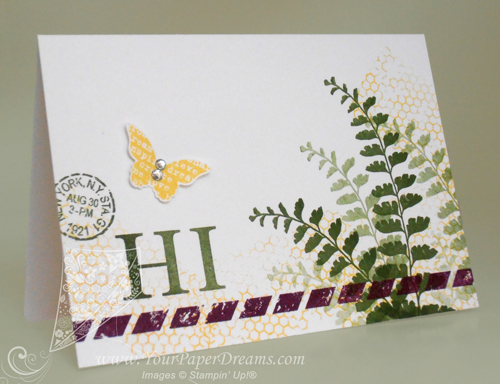
Just finished making a big pile of these notecards, and I simply can't get enough of this Butterfly Basics! I am going to be SOOOOO sad if that stamp set doesn't make it into the upcoming catalog! Thankfully, we demonstrators will get to see the new catalog early tomorrow morning, so I don't have too many more hours to speculate and worry, lol.

Butterfly-Basics-notecard----web

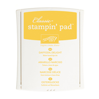
As I was selecting colors for this design I knew I would use a green, of course, and I wanted 2 other bright colors as well. So I started by pulling out Mossy Meadow for my green, and then grabbed that super-yummy Blackberry Bliss as long as I was in the 2014-2016 In Colors section anyway. Daffodil Delight, which was already on my work table, seemed handy for the remaining 3rd color.

When I work with 3 different colors I usually think in terms of "large", "medium" and "small" volumes of the colors. So I decided for this card my "large" volume would be  Mossy Meadow, "medium" would be Daffodil Delight, and the splash of "small" would be done in Blackberry Bliss.

I started by playing around a bit with 1st, 2nd, 3rd and 4th generation stamping for the fern images….. working to get the angles (and rhythm) arranged in a way that would be quick and effective for the couple dozen I was just about to crank out. So that part went down first – on the entire pile of notecards. (Actually, when I'm cranking out a big bunch of cards just alike, I prefer to work assembly-line style, doing the same step on each card. That gets me in a rhythm and eliminates putting tools down and picking them back up again. Because every time you open or close an ink pad, or pick up or put down a stamp, time is ticking by.)
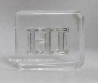
P4290196---webNext came that whimsical and unexpected stripe of Blackberry Bliss parallel to the bottom edge, and then a grouping of 3 images to help balance the weight of the dark ferns. The first part of that grouping, the word "HI", is from Sophisticated Serifs, another Occasions Catalog stamp set I surely hope also transitions into the upcoming catalog because I've found a lot of uses for THAT, too!

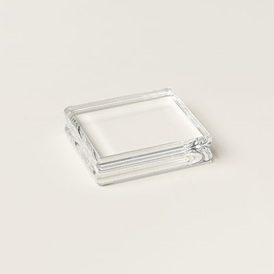
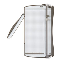
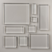
To get the letters even with one other I started by laying them down on the grid surface of my paper trimmer, the same way I demonstrated here. Once they seemed properly aligned, I just set my acrylic block straight down on top of them (with its lower edge also aligned with the grid) to pick them up as a unit. Of course I tested them on my grid paper before proceeding, and ended up adjusting the "I" slightly before calling it perfect. But from there on I was able to stamp the two letters together as one image. For placement, I just eye-balled it and aimed for about 1/3 of the way up, and 1/3 of the way in from the left. (Rule of thirds.) Figured that was generally close enough to be acceptable.

The remaining two images of the grouping of 3 also came from Butterfly Basics, with the butterfly being stamped onto scrap Whisper White cardstock and punched out with the Bitty Butterfly punch. A few random thumps of Daffodil Delight applied with that fascinating background stamp from the same set pulled the images together, and a couple of rhinestones on the butterfly finished it all off.

NOW to get these addressed and into the mail!

Product List
Another “under $80” card – Painted Petals

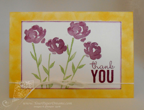
$80 products logo - tipped leftIn my last post I shared about our recent team swap challenge and featured a card sample that was very similar to the one I submitted for our swap. Today I've got another one using that very same stamp set (Painted Petals – from the Occasions Catalog), but highlighting different stamps and colors. AND it's ALSO under 80-bucks ($74.65) and makes 20 cards with envelopes, too….. making a great choice for a new stamper. 

But the combination of flowers and leaves I've used on this card can prove a little bit tricky to get aligned until you're familiar with how they fit together. So I do recommend either choosing the totally clear photopolymer option – or plan to get the Stamp-a-ma-jig involved if you've got clear-mount or wood-mount. Either way will workP4200162---500---copyright.

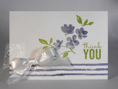
For this card, which is stamped on one of our notecards that come 20 to a package and include coordinating envelopes, I stamped the 3-line image twice across the lower part of the card, and then stamped the "thank you" words before tackling the flowers. (This helped me decide where to put the flowers, and at what angle.)

As to the flowers, here are some tips for getting them in place – and aligned.

First, if you've chosen the photopolymer version of this stamp set, make sure you've not got a "boo-boo" set. The first few sets to roll out the warehouse door when this set was first brand-new were cut incorrectly, and each flower was cut apart from its neighbors. But there are *supposed* to be only 13 individual stamps in this set; if you've got more than that, you'll want to contact the demonstrator through whom you purchased your stamps and arrange for an exchange.

Once you've determined your stamp set is ok, select and mount these 2 stamps – a set of flowers and a set of stems and leaves. I used a "D" block for the leaves and an "H" for the flowers. (Included in the price mentioned above.)

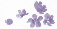
Painted Petals - flowers

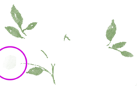
Painted Petals - leaves


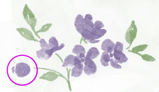
I like to begin by orienting my leaves as shown above. Working with this orientation seems to be the key to the whole thing, for me. Note the single stem is at the left; shown with the pink circle. Go ahead and stamp your leaves.

Now the flowers get placed in that very same orientation; the single bud goes at the end of the single stem. Here's what it looks like when they're matched up. See how the other flowers fit in around the other stems and leaves? You may havePainted Petals - together to move or rotate your flowers slightly to get it just right. If your hands are unsteady or it seems particularly awkward, it's probably time to pull out the Stamp-a-ma-jig.

Once everything was stamped, I simply finished off the card with a bow. Pretty quick and easy – once you figure out how the flowers and leaves work together!

Have fun!


Product List

Glue Dots

$4.95

April’s swap challenge – under 80-bucks

$80 products logo - tipped leftOne of perks I love about being a demonstrator is participating in the fun events that both Stampin' Up! (the company) and our various teams sponsor. One of the events my team (Paper Dreamers) holds is a monthly card swap – usually centered around a specific theme. For this month's Card Swap I challenged everyone to create a card that could be made with $80 or less in product (not counting s/h & tax). Something a total novice stamper could make from start to finish.

Ok, so I'll bet you're already thinking, "So that's not too tough", right? You just throw in a small set of stamps, some cardstock and ink, and you could whip something up for half of that, huh? Well, noooo, not exactly….. because not only did we have to choose a versatile stamp set, but also had to consider that a new stamper would have to purchase any required tools and accessories, too. (Um, and oh yeah, don't forget that one-time purchase of acrylic blocks, if necessary – and gotta include envelopes!) Ok, so because of those restrictions we WERE permitted to assume use of ordinary household supplies such as basic scissors, pencils and rulers. But all "craft" type stuff had to come from Stampin' Up! and be included in the $80 budget.

As I expected, this turned out to be quite the challenge for those of us accustomed to just pulling out whatever we have in our craft rooms. In fact, it may have been the toughest swap challenge I've ever proposed. (Based on the numbers of questions that arose while everyone was working on their designs.) But in the end, our swappers came through with flying colors and turned in amazing results! I'm super, duper proud of those who accepted this challenge!

Now personally, I got kind of excited about the whole concept and didn't stop at just 1 design; in fact, as long as I was in that $80 mode, I made 3. (But then if you know me at all, you already assumed that, huh?) And then once the swap cards arrived I put together a display of several of them so you'll be able to see that at my next gig.

P4200153---500---copyright


Here's one similar to what I included in the swap; it squeaks in at just under the limit – at $79.60 in product – and yields 20 cards with envelopes.

For my design I knew I really wanted to simulate the effect of layers of cardstock, but the budget wasn't up for allowing multiple colors of real cardstock. So I called on one of my "go to" techniques: adding color to white cardstock with a dauber or sponge. (In this case, I used 2 of the 5 daubers in a package: one for Daffodil Delight and the other for Rich Razzleberry.)

And I do love the versatility of that Painted Petals stamp set, so naturally the next card in this $80 series featured that, too.

And hey! Before I close out today, just wanted to remind y'all that the list of retiring products is due out tomorrow (Tuesday, April 21). So that means that TODAY is the best day to grab those "gotta have" items that may still be on your wish list, because once they get published to "THE LIST", the most popular ones are prone to selling out in a flash! So take a few moments today to review your wish list (especially regarding ribbons & trims, punches, Project Life by Stampin' Up!® and anything in the 2013 – 2015 In-Colors) and seriously consider ordering them today!

Product List
Another use for your Stampin’ Up!® Paper Trimmer!

Aligning letter stamps

As part of my protracted rebranding process I've been needing to redesign the "welcome" cards I send to new team members, and I recently sat down to do that. The previous cards I'd been sending had been created and printed through our MDS software and printing services, and they featured our team's previous branding colors. This time around I wanted something I could stamp myself, yet keep most of the design contemporary with current stamps. And of course I wanted to use the word "Welcome" in it.

Weeelllll, a thorough study of my collection of current stamps turned up only the "Welcome, Baby" from Petite Pairs. I cogitated on that for a while, knowing I could mask out the extra word, but then decided the whole thing was just too tiny for my vision anyway. Eventually I settled on the photopolymer alphabet set "Back to Basics Alphabet". I really like the simple style of that set, and I've used it several times, but I rather *dislike* the process of lining up all the letters!

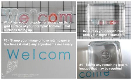
The way I've aligned letters in the past has been to place them flat-surface-up onto my grid paper and then once aligned, plop the acrylic block over the entire word or phrase. That gets them "pretty close", and usually only a little touch-up to alignment is required afterwards.

But what makes me crazy about the process is that the "very sticky" photopolymer pieces stick to *everything* in the process: my skin, my nails, any tools I might try to use to nudge a letter this way or that just the teensiest bit. To say the process takes patience is an understatement. Ask anyone who attended last month's card classes where we were using our own initials for one of the designs…. and THAT required only THREE letters, lol!

So after beginning the same process with these much smaller letters, a rare flash of brilliance (and believe me, such moments occur VERY rarely in my case, lol), made me grab my Stampin' Trimmer, and I tried the same process on ITS grid line! And the results were AMAZING…… because the stamps actually STICK to the grid and don't get knocked all kattywampus if you happen to breathe!  So I got 'em all lined up in a flash, and then pressed the acrylic block down and Voila!…… aligned letters all ready to use!

Click on the image up above for a full resolution view.

Product List
 

Gift box for 12 cards

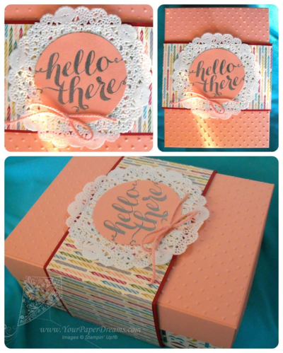
Gift box of 12 cards
I recently offered to provide a hand-made gift for an auction that would be part of a fundraising event. And of course what would I choose, but a selection of cards?!? The committee had in mind a dozen all-occasion cards, so that's what I prepared…. along with the gift box shown here. The Designer Series Paper you see on the box is retired, but these types of applications offer me the opportunity to use up some of my stash.

As you can imagine, 12 different card designs with coordinating lined envelopes – each set individually packaged in a clear sleeve, took (shall we say), "a bit of time", and I was so intensely focused on getting this project ready to deliver by the deadline that it didn't even occur to me to try to get pix of the cards.  But I did snap a couple pix of the box, even if not great ones.

For any basic box that is likely to be handled over and over again, I often like to use a "belly band" to hold it closed. For my belly bands, I usually custom wrap a length of cardstock around the box, and then wrap that with a layer of two of contrasting DSP. And depending on the style, I'll usually add some type of focal point on top.  In this case, I just stamped the words (from the stamp set "Hello There"….. host-exclusive set, page 237 of the Annual Catalog) with Versamark ink, and then heat embossed with Silver embossing powder. The words "Hello There" seemed particularly appropriate to me.

I then pulled out my favorite Framelits set "Circles Collection" (don't you agree that's GOT to be the  greatest workhorse of our entire collection of Framelits?!?), and found just the perfect size. Mounted that on top of one of our doilies and added a coordinating bow – made from Crisp Cantaloupe thick twine. Sure hope it goes to someone who appreciates the concept of "handmade", lol.

Bokeh with Less Mess

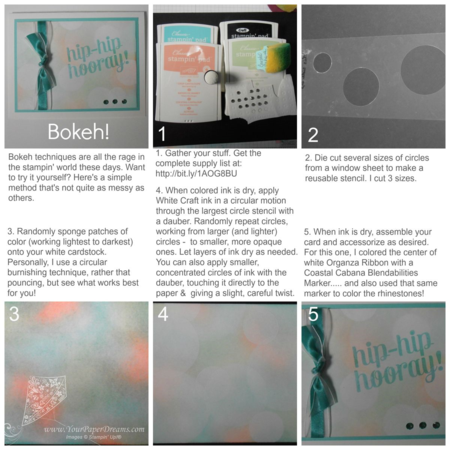
You've probably seen how those dreamy Bokeh techniques are all the rage in the world of ink these days. And some methods are certainly messier than others. I do love me a real good messy crafting session from time to time, but when I decided it was time to try out *this* look, I didn't find myself particularly in the mood for one of those super-messy sessions. So here's how I did mine….
 
Bokeh with less mess large

Click image to view larger, or catch the full resolution version here.
 
Because of the very soft colors I chose, it was really hard to photograph this in such a way that the subtle color variations show, but in real life it does indeed have that soft dreamy look I was after. I'm anxious to try it with bolder colors next, as well as perhaps adding a tiny touch of color by blending a little colored ink refill with some White Craft refill.  Can you imagine what that might look like?
 
And don't you just love the Blendabilities?!?  Being alcohol-based, there are SO many surfaces you can apply them to! They're so pretty for coloring one of our white ribbons to match your project, and for rhinestones and pearls, too. The easiest way is to do your coloring while the embellishment is still on its paper backing – and then let it dry before moving it over to your project
 
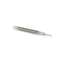
OH! And something else about those rhinestones….. do you ever have trouble getting them aligned? Well I USED to…. until I figured out a trick that works for me. Using the holes of the Essentials Paper-Piercing Template, I pierce a few tiny marks on my paper, and then place the rhinestones right over those marks! Voila! Automatically aligned and evenly spaced!
 
Product List
New Work

New Work

This is an example of a post. You can add content, images, video and more to posts. You can also link textbold text and italicize text.

Lorem ipsum dolor sit amet, qui ex civibus qualisque adversarium, ad sea iusto scripta adipiscing. Nobis interesset est ad. Ex odio laoreet antiopam. Per id reque verear veritus. Eu animal dolorum vel. Ius te vero sonet consectetuer, eam vide nihil referrentur eu.

Magna appareat vel ex, et nec modo lorem. Duo at velit corpora dissentias, ad nobis invenire reformidans. Dolor aliquid vituperatoribus et vim, possit virtute mei at. Affert ornatus nam ea, ea fabulas detraxit mei. Saepe dictas admodum in vix.

Example Heading 1

Example Heading 2

Example Heading 3

Example Heading 4

Example Heading 5
Example Heading 6

 
Case probo mei et, diam veniam pro no. Vel te stet rationibus voluptatibus. Dictas fastidii definiebas at vim, numquam temporibus eos id. Pri no incorrupte consequuntur, cu pri vivendo tacimates urbanitas. Liber accusamus no pri, rebum gubergren id eum.

  • Example list item 1
  • Example list item 2
  • Example list item 3
  • Example list item 4

Eam omnium iuvaret at. Ut reprimique neglegentur consequuntur eum. Qui ad tantas scripta impedit. Ut nostro comprehensam vel. Ad veri veniam inimicus ius, eum oratio mollis no porro.

This is an example of a blockquote. Lorem ipsum dolor sit amet, qui ex civibus qualisque adversarium, ad sea iusto scripta adipiscing.

Magna appareat vel ex, et nec modo lorem. Duo at velit corpora dissentias, ad nobis invenire reformidans. Dolor aliquid vituperatoribus et vim, possit virtute mei at. Affert ornatus nam ea, ea fabulas detraxit mei. Saepe dictas admodum in vix.

Welcome to Occasions and Sale-a-Bration 2015!

They're here! They're here! Not only does the Occasions Catalog (which I sometimes call the Spring Catalog) launch today, but so does Sale-a-Bration!

2015-OccasionsCatalogSo far, the reviews for the Occasions Catalog have been amazing, and from a personal standpoint I am SO ready to think spring, even as we are in the height of winter around here. So the moment I laid eyes on the cover of this year's catalog my heart melted. (If you're a flower-lover like I am, I'll bet yours will too.)

And the Sale-a-Bration (SAB) offerings are STUNNING this year! 2015-SABcatalogsGorgeous stamp sets, a couple of DSP (Designer Series Paper) collections (including a unique tone-on-tone design just screaming for some fun color-application techniques), a Project Life kit, and even free (yes, FREE!) Stampin' Blendabilities Markers! Here's a refresher about how Sale-a-Bration works:

  • Customers – You can't buy 'em; you can only get these exclusive SAB items for FREE. Choose one SAB item for FREE with every $50 regular product you order
  • Party or Class hosts – Get $25 BONUS host dollars when your event reaches $250 in sales
  • New Demonstrators – Join Stampin' Up! during Sale-a-Bration and choose a project kit from the Occasions Catalog for FREE, or choose any 2 SAB items for FREE
  • ALL demonstrators – Get all the perks that customers and hosts get, PLUS earn additional credit for ANY free merchandise of your choice by selling and sharing during SAB!

This is gonna be one FUN spring!

My regular customers on Whidbey Island were able to pick up their complimentary catalogs in Freeland this past weekend, and Post Falls area ladies will get theirs at Card Class on Thursday. If you don't already have a demonstrator with whom you work and purchase, I will be happy to provide you a complimentary set (2015 Occasions Catalog & SAB brochure) – for just the cost of mailing, should mailing be necessary. (Please contact me to inquire about a couple of options.) In the meantime you'll probably want to check 'em all out via their PDF's by clicking on the images above.

So let's STAMP! I'm booking hands-on Card Classes and Introductory Parties now; contact me to reserve your play date soon. But if you just can't wait for playtime, of course you can order right now at: store.YourPaperDreams.com 

Christmas Cards by YOU!

Some of my favorite moments of the holiday season are opening handmade cards from my stamping friends.  I got some beautiful ones this year, and would like to share them here. A couple today, and some others in subsequent posts…..

PC290310 copy

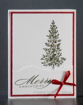
First up, this totally elegant and simply-stated tree from Kathy Adams. Done in traditional red and green, I ADORE the torn white layer at the base of the tree, suggesting a snow drift. Not so obvious in the photo, are several carefully-placed dots of red glitter adorning the tree, too. I have always believed the key to a simple and elegant card is balance, and Kathy has nailed that. BEAUTIFUL, Kathy!

PC290311 copy

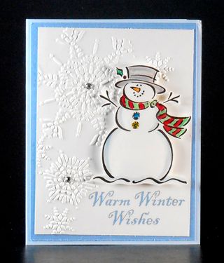
I was still sliding Frosty from his envelope when I felt a big warm grin overtaking my face! Although Frosty's been gone from the Stampin' Up! line-up for several years now, he was a faithful icon for many, many years. (Back in the day, every time a new catalog came out we'd always rush to see if Frosty had survived the cut to get to hang around and play for another year. He even eventually earned the nick-name "Frosty, the Teflon Snowman", lol.) I remember showing all kinds of projects with him at Club and at Stamp Camps: basic cards, 3-D flip cards, glass Christmas tree ornaments….. But as often as I used him I never grew tired of him, and to this day he still brings on that great big grin whenever he shows up. So it was pure delight to see him reappear in my mail this year. Sharon Clark, my longtime dear friend and upline (yes, you can blame HER for this amazing nearly-19 year journey as a Stampin' Up! demonstrator….) was the creator of this charming card.  Thank you for the nostalgia, Sharon!

Merry Christmas

Wishing all my Stampin' Up! family (Customers, Downlines, Uplines, Sidelines & company employees) a very Merry Christmas! Thank you for being such an enormous blessing in my life!

Christmas 2014